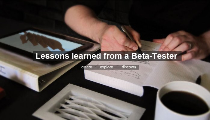
It started as pure curiosity for me. I wanted to get in the know about the future of the software I’ve been using for so many years. When I was working at a start-up architecture firm (now-defunct) they allowed me the freedom to pursue pre-releases of programs like Revit. I credit this interest to working with dRofus Managing Director David Patera, at the time, a recent UNL Architecture grad like myself. David always seemed to have a leg up on our competitors by knowing what the next release of many software’s were capable of. My first experience of this was seeing the revolutionary GUI change from Revit 2009 to Revit 2010. We were able to experiment with the new “Ribbon” interface as Autodesk called it, long before it was released. So when it did come out to market we were not only used to it but were perceived as experts to our consultants and peers. Why wouldn’t we be? We were using it for 7 months before the release, and nearly 20 months before many firms adopted it. Speed, high-comfort level and no-cost training were the pay-offs.
Lesson Learned: Early adoption has its downside too. One of those lessons is that it helps to load the beta software’s on a separate hard-drive partition or a completely separate computer. I can count on both hands how many times I accidentally opened a project in a pre-release only to realize I couldn’t save it back to our actual production version of the software. Ctrl+Alt+Del “End Process” and I became close friends.
In the world of architecture, you also travel down the path of graphics. This was my introduction to web design and even a slew of online web development kits. One of those being CubeGL. In 2011-12 I was running a research program about size and proportion of patient rooms. It was selected by Healthcare Design Conference 2013 as a topic for me to present that year in Orlando. http://www.healthcaredesignmagazine.com/blogs/jennifer-kovacs-silvis/are-patient-rooms-too-big

With the help of my wife Ashley, who happens to be an expert web designer, we were able to experiment with this idea of 3D rooms on a webpage that allowed for interaction by the user. You should see what she’s up to now! This was years before the advent of Google Cardboard (released June 2014). We were able to use an experimental “spherical” room generator plugin for WordPress and develop multiple sizes, layouts and proportions of patient rooms and also allow for survey participants to type comments. http://patientroomdesigns.com/
Lesson Learned: This technology only really worked with modern browsers such as Chrome, Safari and Firefox. At the time, most everyone was still using Internet Explorer. Choose your technology wisely and make sure you have a plan to implement cutting edge concepts to your users. Our way around this was to have a pop-up screen appear when the user opened the link in Explorer, prompting them to download Chrome. This was also a challenge, so we eventually did get it to work in Internet Explorer.
Now back to architecture. One of the big changes in architecture is the advent of rapid prototyping or “3D printing” as it’s known. At UNL I was one of the first, if not the first student to 3D print a competition project that I had recently won. (AIAS 2006 – Boston Kiosk) Time and time again my model failed to make itself “watertight” meaning that it was a solid mass with no hollow spots water could seep in. This led to a lot of deep research on how I could streamline that process, learn about the many different types of 3D printers, the cost, time and materials it takes to produce a print.

Over and over again I became increasingly better at understanding the intrinsic details of how to model and what to avoid. Eventually I applied to be selected for Autodesk’s Ember 3D printer. I tweeted direct to Carl Bass, CEO with a 140 characters convincing argument as to why I should be selected. Needless to say, it worked. This 3D printer is awesome! It’ll print a toothbrush, the bristles on the toothbrush if you do it right to that precision. This was always my enemy in 3D printing, minimum size. Most printers on the market will easily let you go below 1/32” or 0.03125”. That’s tiny, but 2×4 aluminum mullions at 1/8” scale is much, much smaller than that. In the past I had to build them thicker for a “printer model” export and then remember to change them back after the export completed. With the Ember, that is not the case.
Lesson Learned: Just because something looks complete and many great examples are used, doesn’t mean you’ll have the same success. Remember, you are beta-testing and not all the features are available, some are known to be broke and some you will have to do the updating to. Take on these challenges only if you have time to commit to them. The reward here was much more exposure to the world of 3D printing and actual hands on experience breaking things and talking with experts from the industry.
There are many more examples of this including creating our own beta-test platform at DLR Group for Data Streams. Will I ever get tired of beta-testing? Well, let’s just say I’ve graduated from Beta to Alpha. Looking forward to the Alpha testing of Autodesk’s Generative design platform: Project Fractal.

Let me know your thoughts and the beta-projects you’re working on! Together we can share our experiences to help make dreams a reality!


